Jeff Wall is best known for his large scale directorial photographs. Large scale directorial photographs? What the hell does that mean? In essence, it means Wall uses an 8×10 view camera to take staged photographs of events in such a way that they resemble a candid photo of a spontaneous moment. He then displays the resulting images at sizes that are large scale. We’re talking really really BIG images. I’ll come back to the display aspect later. For now, let’s focus on the directorial aspect.
Wall, a Canadian born in 1946, is less interested in photography than he is in art. Photography is simply the medium he happens to work in. He studied art and art history at the University of British Columbia in Vancouver and at the Courtauld Institute of Art in London. He teaches art. He’s an academic as well as an artist. Among the things that means is that he approaches his work from a different perspective than most of us. He approaches his work rather like a painter. He has the image in his head before he actually creates it.

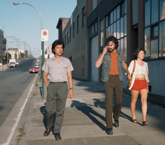
Despite this studied approach, his work generally feels almost improvisational. Take, for example, the photograph above. It has a rather photojournalistic aura; it looks and feels like an unscripted street scene in which a man displays his racism. The street is nondescript; it could be any street in any North American city. The racism is as casual and nonchalant as it is offensive, using an obscene gesture to ‘slant’ his eye. It’s the unthinking banality of the racism that makes it both common and pervasive and all the more quietly pernicious. The people involved are ordinary people from slightly different social classes, yet there is a definite class component to the underlying resentment and racism. It looks like a moment captured in time. And it was completely staged.
Wall stated that he’d seen an incident like this take place as he walked along the street in Vancouver. He decided to recreate the scene as a work of social justice art. He hired actors to be his subjects, he found a bland nondescript street, he set up lights and the tripod for his large format camera. He selected the costumes the subjects wore. He directed the way the actors moved, the way the racist drags his girlfriend forward, the way she squints in unconscious mimicry, the aggressive stare of the racist, the quiet side-eye resentment of the Asian man. He wanted the photograph to be more real than the incident itself.
It’s that director’s obsessive attention to detail that’s the hallmark of Jeff Wall’s work. He’s voiced his open admiration for the concept of the “painting of modern life,” which grew out an essay written in 1863 by Charles Baudelaire. The painter expressed his admiration for artists who are able to make epic statements about modern times through images of ordinary aspects of contemporary life.
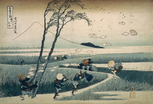
A great deal of Wall’s work seems to be an attempt to be such a “painter.” He even recreates the work of painters he believes met Baudelaire’s standard. For example, Wall is quite taken with the woodcuts of Hokusai, a Japanese artist who lived in the late 18th and early 19th century. In the following woodcut, Hokusai depicted a sort of Cartier-Bresson moment — a decisive moment.

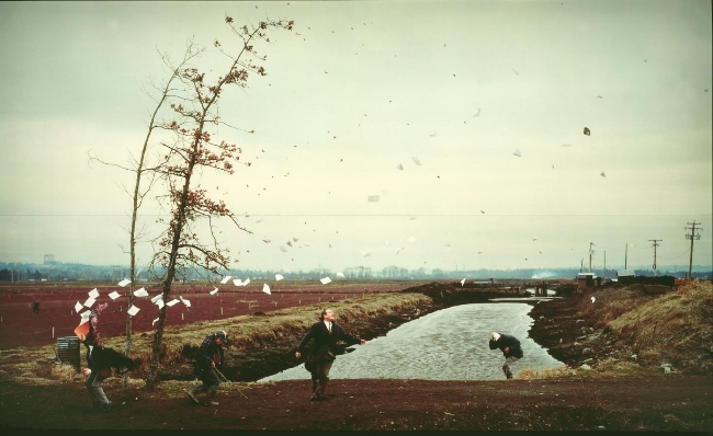
Wall recreated the scene on a cranberry farm in rural Canada. In keeping with his obsessive, directorial style, he staged the photograph with great care. He selected the location to match Hokusai’s wind-bent trees. He had the subjects crouch and hold their hats similar to Hokusai’s. He recreated the hat that was blown away, and the scattering of papers. And yet he made it a completely contemporary image by setting it in a Canadian landscape and including the line of telephone poles.

Wall’s photo has all the drama and spontaneity of Hokusai’s woodcut. There is a wonderful sense of immediacy and tension. How was he able to create such an atmosphere and still reproduce Hokusai’s image so faithfully? By using the magic of digital imagery. Wall’s image is actually a composite of more than 100 separate photographs taken over two Canadian winters.
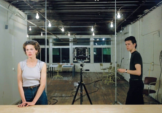
Wall’s ‘signature’ photo is in the same vein–a modern take on Edouard Manet’s painting A Bar at the Folies-Bergère (which, by the way, is hung in the Courtauld Gallery where Wall studied). In the painting, a woman is standing in front of a mirror engaged in some sort of interaction with a man (who only appears in the mirror). Wall created a similar arrangement — with a similar intentional play on perspective — in his photo. The implied viewer (the camera) is located between the woman and the man, just as the invisible painter in Manet’s work is situated between the man and the woman.

On the surface, it’s a simple image. But the strange perspective, the echoes of Manet’s painting, the implied social and authority status of the figures (the artist and the model he hired), the deliberate lack of emotion in the model, all add layers of complexity to the image.
And that brings us to Wall’s use of scale. The man likes BIG images. Some are more than seven feet high, up to sixteen feet wide. And these aren’t just massive prints hanging on a wall; they’re transparencies — giant slides, if you will — displayed in huge light boxes similar to those used by doctors to view x-rays or those you see in airport terminals for advertising purposes. To Wall, the use of the light boxes changes the tone of the image and influences the way the viewer understands them. He says the boxes turns the images into something that “…is not photography, cinema, painting, or propaganda — though it has strong associations with them all.”
The reference to cinema, I think, is telling. Some of Wall’s critics complain of the way he staged his better-known photographs, claiming the artificiality mocks real life and is a pale imitation of it. And there is perhaps some truth in that. But the same could be said of the cinema, of any non-documentary movies. Is the movie American History X a less effective commentary on racism because the actors were directed and the scenes carefully staged and filmed? Is The Godfather less interesting as a study of the seduction of power and the power of family because it’s so beautifully filmed?
Wall is, in effect, producing movie stills. He’s artificially recreating moments that have, or could have, happened — only he’s doing so with an eye for aesthetics that reality generally lacks. He inserts an element of control over reality. I’d argue that every photographer who has ever taken an artful photograph has, at one point or another, wished for the ability to control reality — to move that tree, or get that ugly bus to move out of the frame, or to hurry the clouds along. Wall follows through on those wishes.
Jeff Wall’s work makes me think more seriously about directorial photography. Whether you appreciate his work or not, I think it’s worthy of thoughtful consideration.
