Sometimes it all comes down to a teacher. For Irving Penn—and a myriad other well known photographers—that teacher was Alexey Brodovitch. To understand Penn, it’s necessary to understand something about Brodovitch, who was the head of the Advertising Design Department at the Philadelphia Museum School of Art.
Brodovitch was a devotee of the Bauhaus approach, which maintains that everything one creates should be done artfully. Regardless of whether the object being designed is a chair, a stapler, or an apartment building, the same level of care, thought, and artfulness should be given to the project. Brodovitch’s workshops had two components, one of which was the theory and practice of design, the other being photography. His workshops and lectures drew some of the most talented photographers of the era—Diane Arbus, Robert Frank, Tony Ray-Jones, Garry Winogrand, and Lisette Model.
Penn, who’d been born in Plainfield, New Jersey in 1917 and attended public schools all his life, enrolled in the four-year design program offered by the Philadelphia Museum School of Art. As one of Brodovitch’s students, he bought a camera—a Rolleiflex—but he had no intention on becoming a photographer. As we’ve seen with so many famous photographers, Penn wanted to be a painter. Studying design must have seemed a prudent compromise. After graduating in 1938 Penn moved to New York City, where he spent the next four years working as an art director—first for a magazine, then later for Saks Fifth Avenue department store. He saved his money and in 1942, at the age of 25, Penn moved to Mexico to devote himself to painting.
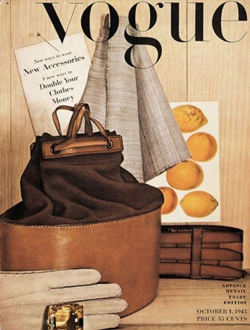
A year later Penn returned to New York City, sadly aware he was at best a mediocre painter. He obtained a job as an assistant to the art director for Vogue. Part of his job was to suggest ideas for photographs to be considered for the magazine’s cover. Penn had only been on the job for a few months when one of the staff photographers objected to his suggestions for a still life fashion photo spread. The art director told him to borrow a camera and shoot the photograph himself. So he did; his photo was the cover image for the October, 1943 issue. It was the first of more than 150 covers Penn would shoot for Vogue.
Although he had no real notion of becoming a photographer until the day he actually became a photographer, Penn took to the camera quickly. Some of that success was surely a result of his training with Brodovitch. Within a couple of years he’d progressed from shooting fashion stock to fashion models. By 1947 he’d begun his first serious portrait work, primarily of artists and celebrities.
Early in his photographic career Penn established a style that made his work immediately recognizable. It’s an elegant minimalist look that’s firmly grounded in his graphical arts background. His style is highly dependent on two factors: first, the removal of distracting background information and second, the use of a very few carefully selected generic props or settings. This quiet manner of photography quickly came to define the post-war New York view of what was chic.
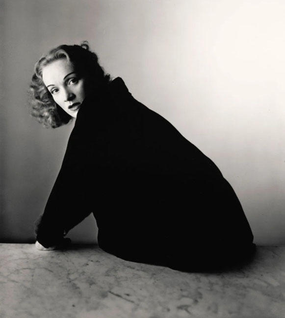
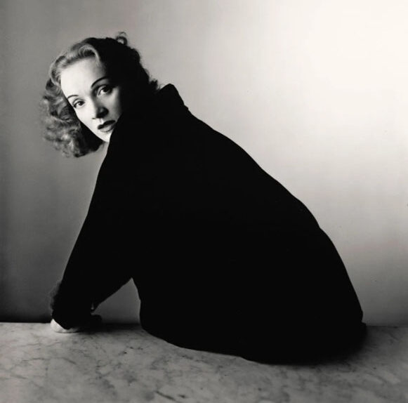
Penn’s signature style is especially evident in his portraiture. By using a seamless neutral backdrop and, most often, a single prop—not a prop to make the subject comfortable, but an environmental prop—Penn reduces the visual component of the image entirely to the subject. There is nothing to distract the viewer’s attention from the subject. Just as importantly—or perhaps more importantly—there’s nothing to distract the subject. The result is sometimes awkward and uncomfortable, but often compelling.
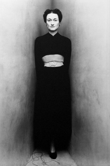
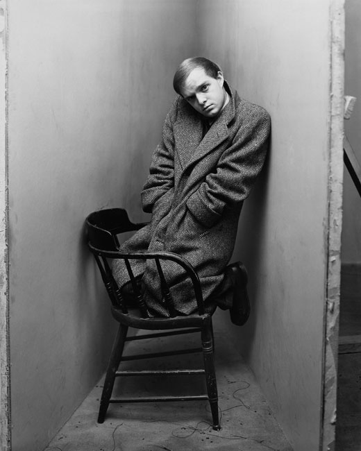
Penn’s approach to portraiture is very calm and controlled, almost clinically impersonal. There’s little room for spontaneity. One would think that would make a very static portrait; sometimes it does. But that approach also has the effect of heightening any spontaneity that takes place, which can lead to some surprising and unexpected images. In one memorable series of portraits Penn constructed a narrow corner by joining a pair of neutral backgrounds together. He placed his subjects (and such a wide range of subjects, including the boxer Joe Louis, actor Spencer Tracy, painter Georgia O’Keefe) within that corner. Their reactions to being trapped between that confining space and the camera were revealing. Some were anxious and uncomfortable, some were completely unflustered, some were almost defiant. Compare the portrait of Wallis Simpson, the Duchess of Windsor, to that of writer Truman Capote.
One of the advantages of this approach—an advantage rarely mentioned in the scholarly articles on Penn’s work—is that it allowed him to work quickly. According to Penn, putting his subjects in such a narrow space “made them quickly available to the camera.” That’s a very telling remark. It didn’t make the subjects quickly available to him, but to the camera. Penn’s portraiture isn’t about establishing a relationship between the photographer and the subject, it’s about composing a graphically pleasing image that reveals something about the subject. My sense is that Penn wasn’t terribly concerned about what the image revealed—whether it flattered or not, whether it was ‘true’ or not, whether it revealed only what the subject wanted to reveal or not—only that it revealed something.
Penn used this same approach with almost obsessive consistency in almost every photographic situation over the course of half a century. Because his style was so simple—because it was almost mathematically elegant—it proved to be incredibly flexible. He used it to photograph individuals and groups. He used it with fashion models and motorcycle gangs, with frozen vegetables and animal skulls. He used it to shoot portraits of fishmongers and charwomen and chimney sweeps in a series reminiscent of the work of August Sander. Even though it was a style developed for the studio, Penn used it when he traveled to photograph what he called ‘primitive’ cultures. He created a tent-studio and took it with him to photograph observant Muslims in Morocco, to photograph tribesmen in New Guinea and Roma families in Spain, to photograph young tribal girls in Dahomey and Hell’s Angels and hippie groups in San Francisco.
As simple as his work is, some of it was clearly ahead of its time. In 1949 and 50 Penn created a series of nudes that were distinctly nontraditional. Having photographed so many svelte young models for Vogue (one of whom, by the way, he eventually married), Penn found himself wanting to photograph bodies that weren’t considered conventionally ‘pretty.’ In other words, women with normal bodies—heavy women, fleshy women, women who (as we say down South) have some sugar on them. Unlike the fashion models he was used to working with, these women weren’t trained to hold a position or to pose in a way that would be flattering. They held themselves loosely, letting gravity have its way.
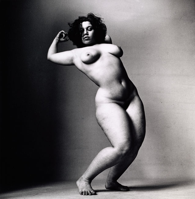
When Penn showed the work to his fellow photographers and the art directors at Vogue, they were not only less than impressed, they were appalled. Edward Steichen, who at the time was the curator of photography at New York City’s Museum of Modern Art, is said to have told Penn “I won’t mention these nudes to anyone if you don’t.” Penn put the photographs and negatives away and didn’t show them to anybody again for nearly four decades. In 1980, at which point Penn was recognized worldwide as a master photographer, the nudes were finally given an exhibition. Many critics were unsure what to make of the heavy nudes. Twenty-five years later, Leonard Nimoy would find himself celebrated for having the courage to photograph heavy women in the nude.
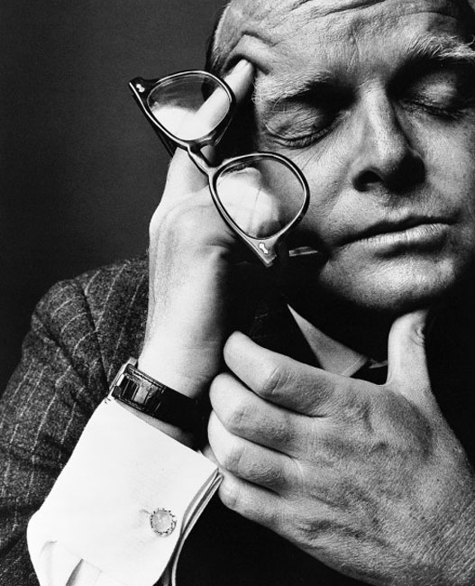
As he matured as a photographer, Penn gradually moved closer to his subjects. You can almost date his portraits by how much of the subject’s body appears in the frame. By the 1980s, his portraits were almost all of the face. The elements of graphic design continued to shape his work, but he seemed to become more interested in the textures of the face. Weathered skin, wrinkles, sagging flesh, these aspects of humanity become significantly more important to the work. And as before, when he put his subjects in a corner, by moving in closer Penn added an element of anxiety in his subjects.
Irving Penn’s photography exists at the intersection of art, fashion and advertising. Regardless of how the photograph was to be used, his approach to the work remained essentially the same. When he was behind the camera, Penn seems to have made no real distinction between art and commerce.
Although for the last couple of decades his work was more likely to be seen in the gallery or hung on a museum wall than in a magazine, it’s important to understand that his aesthetic was initially developed with the printed page in mind. Certainly size matters (in some regards, at least) but perhaps the most astonishing—and perhaps the least noticed—thing about Penn’s photography is that it works well regardless of its size. It’s effective as a museum-sized print; it’s effective as a thumbnail. And why? I’d suggest it’s because of Penn’s background in graphic design. A pleasing shape is a pleasing shape, regardless of its size.