If you want to understand the photography of Joel Sternfeld, you have to first understand this: his work has always been about color. I don’t mean ‘color’ in an abstract, purely compositional sort of way; I mean ‘color’ as informed by science and theory. If that sounds painfully dull and devoid of passion, just look at Sternfeld’s photographs; you’ll find it’s neither.
His color palette may seem whimsical and capricious, but you can rely on this: it’s not. There’s nothing arbitrary about his use of color. He uses color, and he does it deliberately.
Oh, there’s no doubt that serendipity plays a role in the colors he finds before him. But Sternfeld only releases the shutter when the colors are right. If the colors aren’t right, he doesn’t shoot the photograph. For most of his career, right generally meant pastel colors, non-primary colors, sometimes pale and delicate, sometimes bright and vibrant, but always purposeful. The color always serves the photograph.
Sternfeld was born in New York City in 1944. Both his parents were artists, so it’s probably not a surprise that he majored in art when attended Dartmouth. He graduated with a B.A in 1965. As part of his curriculum, he studied the Bauhaus School—in particular the color theory of Josef Albers. At the heart of Albers’s color theory is the notion that color is absolute, but the way we experience any particular color is necessarily relative to its surroundings.
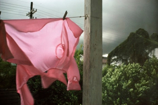
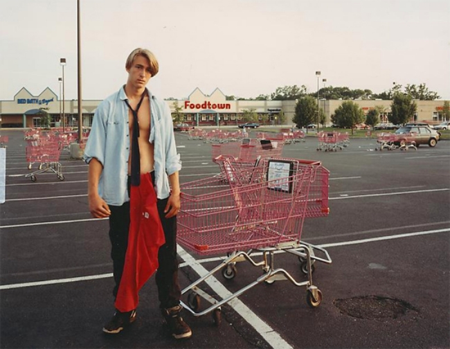
What the hell does that mean? Let me give you an example: the color pink in the shirt in the photograph above is the same pink all over, but we experience its pinkness differently relative to the other colors in the scene. Not only does our perception of pink vary when it’s presented beside the various shades of green or grey, but it varies depending on different amounts of light passing through it. Yet it remains pink.
The Bauhaus School also stressed the interconnectivity between color. form and emotion. It’s the emotional content that makes Sternfeld’s work unique and important. What we see in his photography is color in service to humor, irony, and empathy.
I suppose it could be said that the color palette was for Sternfeld what the decisive moment was for Henri Cartier-Bresson. For Cartier-Bresson, the fleeting cohesion of geometry of form and line at that ‘decisive moment’ was what moved him. For Sternfeld, it’s the sight of a pleasing color palette.
After graduating from college, Sternfeld did what photography students did during the late 1960s; he went on the road with a 35mm camera and rolls of Kodachrome. There were other art photographers who were beginning to work in color film in those days, of course, and Sternfeld was aware of the work of William Eggleston and Stephen Shore and Helen Levitt. In fact, he sought out Levitt, whose work, according to one critic, “offered a model for a poetic street practice in which the resulting photographs combined compositional assurance with the appearance of coincidence.” She became something of a mentor to him.
I’m going to make a second comparison to Cartier-Bresson here. Cartier-Bresson’s career accelerated when he found a tool that allowed him to create the type of photographs he wanted. The same is true of Joel Sternfeld. Despite the quality of his work—the careful blending of a color palette with subject matter—Sternfeld didn’t begin to make a mark on the art photography world until he began to use the right tool. For Cartier-Bresson, that tool was 35mm the Leica. For Sternfeld, it was a large format 8×10 camera.
What’s remarkable is that despite his taking up such a slow and cumbersome form of technology, Sternfeld’s work still retained the sort of immediacy one expects to see from 35mm. That’s readily apparent in what may be his most well-known photograph.
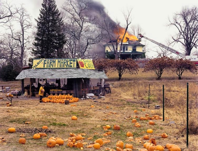
This photograph, at first glance, has the feel of a snapshot. But it’s a perfect example of Sternfeld’s work. There’s the color palette—the orange of the flames and the pumpkins complement the yellow of the dead grass and the firefighter’s jacket and the sign on the small market stall and the upper story of the burning house. There’s the humor and irony—a firefighter shopping for pumpkins while the house burns behind him. There’s an ineffable aura of poignancy—a sort of a melancholy emotional sting at the sight of somebody’s home on fire. And there’s the careful but fluid composition that directs the viewer’s eye to the important elements, yet keeps the eye in continuous motion. And remember, this wasn’t simply a matter of raising the camera to his eye and releasing the shutter; this photograph involved setting up a tripod, attaching the hefty 8×10 camera, adjusting the front and back standards, composing through the ground glass, and then releasing the shutter.
That photograph was part of Sternfeld’s seminal work: American Prospects, published in 1987. That book, like so many photography books of that era, was essentially a travelogue, a personal but universal documentation of Sternfeld’s road trips around the U.S. If that sounds dismissive, it’s only because so many people have relied on the same concept. It’s true that the subject matter of American Prospects is no different than those of hundreds of other photography books. The important difference is Sternfeld’s photographs are tied together by his consistent attention to the color palette.
He’s brought that same aesthetic to his next projects, On This Site: Landscapes in Memoriam (1996) and Stranger Passing (2001). The former includes photographs of the locations of tragic events. Sternfeld describes the project as a “list of places I cannot forget because of the tragedies that identify them.” This includes such diverse places as the San Francisco office in which Harvey Milk (the first openly gay man to be elected to public office in the U.S.) was assassinated by Dan White in 1978, the crab apple tree in New York City’s Central Park under which the body of Jennifer Levin was discovered in 1986, the corner of Austin Street in Kew Gardens where Kitty Genovese was stabbed to death in 1964, and the 36 square block neighborhood called Love Canal in Niagara Falls, NY which was built on top of dump site containing more than 20,000 tons of toxic waste.
Where On This Site is a catalog of places, Stranger Passing is a catalog of people. Not a catalog in the style of August Sander, who was primarily interested in archetypes, but a catalog of ordinary people going about their ordinary lives. A lawyer carrying his dry cleaning, a pair of Silicon Valley men comparing their Palm Pilots, a woman in a Malibu beach house after exercising, a couple of men on vacation in Montana identically dressed in a sort of cowboy drag, a kid gathering shopping carts in a strip mall, two suburban boys walking home from school.
These are clearly not candid portraits, yet they retain a pleasant aura of informality. Despite that, there is a uniformity to the photographs unlike Sternfeld’s earlier work: the subjects are all photographed from about the same distance, they’re all directly facing the camera. And yet there is still that careful concern about the color palette, still the subtle sense of irony, still the flashes of puckish humor. Surprisingly, there is an odd cohesiveness to this series of portraits that links the diversity of the United States together in a way that Sander attempted but failed to do with his archetypes of German culture.
Joel Sternfeld has gone on to other projects. He photographed New York City’s High Line before it was transformed into a public space (a mile-and-a-half section of abandoned elevated train line). He photographed the locations of American experimental utopias (everything from hippie communes of the 1960s to odd Christian health and curative resorts to Slab City, a sort of semi-functioning anarchic subculture that still inhabits a former Marine barracks in the Mojave Desert). In one of his most recent project, Sternfeld used an iPhone to photograph shopping malls in Dubai.
The subject matter may change, the camera may change, the approach may change, but Joel Sternfeld’s work is held together by a consistent and coherent vision. In the same way that Cartier-Bresson, through long practice, intuitively incorporated geometry into his compositions, Sternfeld continues to integrate a coherent color scheme in his work. It shapes his photography, it sparks his vision, and it unifies everything he does.
That’s pretty remarkable.